Hey there,
I hope you're ready for one of the most detailed newsletters I have ever written. This has been a busy week for me as I juggle preparing for BFCM, making a few key hires, working on retail expansion for CROSSNET and launching a new creator led brand called Good Sport. We were supposed to launch Good Sport this Wednesday but the world of supply chain sadly had other plans. Just a day in the life of a founder!
This week's newsletter is all about designing packaging that helps drive sell-through at retail. This is CROSSNET's first box I made in Photoshop...
The Before

When we first started there was no chance we could afford a graphic designer. The one thing I got out of my $100k film degree was the one Photoshop class that taught me how to make a fake ID and then this shitty retail box. All jokes aside, we really didn’t have the money, time, or even the awareness of how important packaging was to the consumer. It's mindboggling that we actually let this package go on the shelves of our first two Scheels locations.
Our mindset was focused on getting the game in the hands of the consumer and viewed the box as something that’d be thrown out– which in theory isn’t wrong, but doesn’t help build brand loyalty. Once our boxes got on the shelves of major retailers and our business started maturing, we knew it was time that our packaging do the same.
The After

This is one of those, a picture speaks a thousand words kind of situations. The difference is really night and day. But the true difference is deeper than just surface-level aesthetics the real change came from switching from a sales-centric mindset to an experience-based mindset. With the help of our newly hired creative professionals, we were ready to learn how to make our boxes showcase our brand, excite the consumers, and stand out.
The Three Most Important Analogies my Creative Director Won’t Shut Up About:
1) Design is an Experience
Ever wonder why you are so willing to pay $5.00 for a latte at Starbucks when you can make it home for 75 cents? It’s the experience– and no I’m not talking about the customer service. From the second you step into a Starbucks the decor, the lighting, and the music all create an inviting environment that turns just your simple stop for a cup of joe into a destination, an experience. If you grew up in Woodstock, Connecticut a trip to your local Bakers Dozen was the best 15 minutes of your day. In Miami, we sadly take this for granted.
Experience is what allows the customer to justify spending $5 rather than doing the financially responsible thing. When your store, packaging, billboard, etc creates something memorable it fosters a relationship between consumer and brand.
2) Materials Make a Difference
I bet half of you still have an Apple product box somewhere in your junk drawer, closet, or under your bed. Why do you still have it? Why are you holding onto it even though it truly serves no purpose? The answer is the materials.
Apple uses a high-quality organic pulp material that feels very important and like something you shouldn’t throw away. Our creative director even told us that back at the agency we stole her from, paper vendors would come in to pitch this material and unload dozens of case studies on how it’s now one of the most popular (and expensive) materials on the market. The luxurious material is part of the entire experience of getting an Apple product. It matches the quality of the product received making the consumer feel confident in the purchase they just made.
3) Unboxing is Part of Your Product
A better unboxing experience equals a more positive relationship between the brand and consumer. Go on TikTok or Instagram for 5 mins, I guarantee you you’ll see a story or post of a product next to its pretty box or an influencer doing an “unboxing with me” of a product. I just got the $140 Last Crumb cookie box gifted to me the other week and what was the first thing I did? I took a video of myself unboxing the $140 cookies. The box, the packaging, the paper inserts, everything about the experience was first class and although I would never buy them for myself, this will now be my go-to instead of Edible Arrangements or flowers when I need to send a gift.
Social media is such a large part of our everyday lives and no matter how small your followers are, you have the ability to influence your friends and coworkers. From the average user to big-name influencers, sharing purchases within one’s audience influences buying decisions and why not put your brand’s best foot out there?
So what does all this have to do with designing a box? Design is so much more than just making something look aesthetically pleasing. There are a lot of systems that need to be put into place for your design to become effective and drive the results you want. Just like fine art, an effective design utilizes all or most of the senses and makes the viewer feel something. In marketing, it’s your job to create the desire in the consumer to purchase and become loyal to the brand aka justifying a decision to purchase a $7.00 iced matcha latte or a $1,000 iPhone.

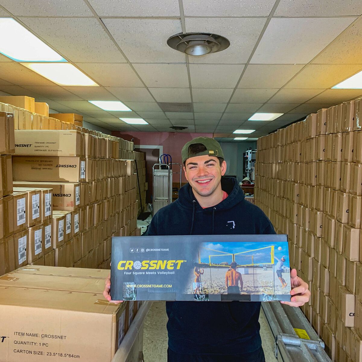
Me with our second box in our old record store warehouse
Thinking with experience first has changed our approach to design. From the three examples above, here is how we applied this new way of thinking to our new boxes.
1) Box Material
We upgraded our box material to a higher quality finish that gave our box a more luxurious look and feel. We aren’t quite ready to drop bands on the stuff Apple uses but we invested in better material that is much sturdy and of higher quality to match the quality of the product itself. This increase in quality was also very important as we needed sturdy packaging to support our 18lb game.
In 2023, we are looking to make further adjustments and print our boxes on a luxurious matte material that will give the box an even better look. The entire experience comes from all the senses so using a material with higher quality subliminally helps the consumer.
2) Design
Again, a lot deeper of a process than just some better imagery and cooler colors.
A) Branding: We started by hiring some of the best retail designers around to give our box a structured design methodology. They helped us dive deeper into our branding and together we came up with a look and feel for our packaging that really highlighted how we wanted the brand to look and feel (for more on how to do this, refer back to August 25th’s newsletter).
B) Methodology: All our boxes follow a design recipe that stays consistent across all boxes. This allows us to not only turn out box creative in a flash but keeps the brand unf no matter what the product is. The whole goal is that when your company launches more than one product, you want the consumer to know it’s your product before even seeing your logo on the box. Here’s a basic breakdown of our box formula:
i. Front - The product title is predominant with minimal, yet supportive copy under it to explain what the game is. Eye-catching imagery is also dominant here to invoke excitement and encourages the consumer to want to learn more.
ii. Back - Features a diagram of how the game is played, a longer form copy explaining more in detail what the game is and how to play, and what comes in the box.
iii. Sides - Are used for marketing other products or sometimes we put our what’s in the box here depending on the box dimensions. You never know how a retailer will position your product.
3) Unboxing
In our first version of the CROSSNET box, we didn’t even create an unboxing experience. The consumer opened the box, and there was just some white sheet of paper instruction booklet outlining the rules and a bunch of poles.
We decided to create all new pamphlets on high gloss quality paper and rewrote our setup and how-to-play instructions to make them super easy to comprehend. We also included a QR code on the box and in the pamphlet that shows videos of both setup and how to play for those who hate reading. The QR code also allows the user to activate their warranty and also allows us to tie consumers who purchase at retail back into our e-commerce funnel.
APP OF THE WEEK:
Recharge - A few weeks ago I wrote about how my buddies over at Tenzo use Recharge to automate their entire subscription business and I just found out that one of my best friends over at Wrist Mafia ships several thousand watches a month through their subscription software too.
I was taking a look at Wrist Mafia’s Recharge Enhanced Analytics dashboard and they have more information on their customers than I have ever seen. Outside of the standard important revenue, customer, and subscription metrics, the Recharge dash allows merchants to track customer lifetime value (LTV), average order value (AOV), and churn rate. This provides an in-depth look at business health and drives long-term strategic planning around customer retention and where to best invest marketing dollars.
Merchants can measure key data to make important business decisions. Obtain and optimize data from four main categories:
Revenue: see the high-level health of your subscription business over time
Customers: understand customer patterns, behaviors, lifecycles, and reduce churn
Subscriptions: determine which product SKUs or variants are most successful
Reports: see marketing campaign performance, and customer actions, and compare your business to others within the same niche
Honestly, if you have a subscription business, its an absolute no brainer. Feel free to email me back and I’ll make a personal introduction to our rep for white glove set up service.
NYC See You Next Week!
Whether you're heading into retail or simply looking to give your customers a better experience I hope you enjoyed the deep dive into what goes on behind the scenes. I'm heading to NYC this Tuesday to do a few live episodes of My Biggest Lessons and also an exclusive founder's dinner.
On the week of September 19th I'll be hosting a free hour webinar where we prepare live for Black Friday. There will be limited spots so if you want an invite reply to this email.
All the love in the world,
Chris

